Friday, 7 April 2017

Artist influence: Nik

I recently came across a background artist who was streaming on Picarto (art website streaming service ) under the name of Nik, he's from Singapore and mainly draws landscapes of Japan, as we can see in the example below:


What I mostly love about his work is the composition and colouring, each background he's created feels as if it's from real life experience with his own interpretation of colours used. In particular in the example above there is a mixture of red, orange, purple, blue, grey, green, yellow and brown. which are all not fully saturated to blend together and to act as a natural palette.

Here is another example of why I love his colouring:


As you can see, it's all the same environment with different atmospheres, each one gives a great understanding of how the background would look like in different settings which is very difficult to achieve. I hope to be able to create an environment that I could recreate different settings for, just to understand what it would feel like, this is not only good for gaining an understanding of what something would look like but also an understanding of how lighting/colours plays with the environment.

Tuesday, 4 April 2017

life's a pitch presentation

Life's a Pitch

We were briefed on what we had to do for life's a pitch, (tldr) this involved joining a collective made by us and having an idea to showcase/presents a pitch for what we would like to like to do as a team.

We all started to join different teams and I happened to join Tess's collective, her collective team members are Vlad, Luke, Brenda and Alex. As I joined we got straight into thinking about ideas for our group, we all ended up agreeing on making an Artbook which represents us all as a group of artist/animators who work in different styles for the clients needs. with a variety of styles, we can all provide our skills to produce work together.

We then researched into how artbooks are firstly made and what layout attracts the audience, I gave some advice to Tess and Brenda as they were looking at layouts, and it seems they took it on board when creating mock up layouts. Tess found a website where we can print out our artbook, she asked us what size we should print at and we all agreed on "A5 landscape".

Tess asked us all to put our drawings into the drive that was just recently made and to select from best work and sketching drawings, here is what I presented to them:


And then each one of us made a small mock up of the layout and presented it through our pitching. We hope to develop this into an actual artbook as it is not that expensive to pint out A5 landscape books from vistaprint and it's an effective way to advertise all our works, which we hope to present at the art exhibition at Leeds collage of Art and possibly Studio 24.


Saturday, 1 April 2017

Moana

There are three aspects of this Moana that I'd love to talk about. The composition, story, and colour within the animation.


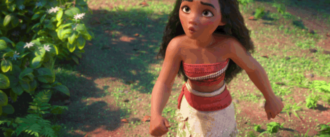
Each scene follows rule of thirds throughout the film and is why it works really well in informing the story, being able to place everything correctly in a composition is important to help the viewer understand what's happening, but this generation audience already understand how it works unconsciously, but as you can see Moana is positioned to the right clearly talking to someone who is on the right being Maui. I hope to take these aspects and apply the way they compose each shot.

The story is nicely written, by that we are introduced to a Demi-god who took something which caused a problem to occur in the world. then we are met with the main protagonist being Moana who is growing up on an island where everything is fine until one day this utopia they were living in falls apart and she is led by her grandma to go out and find the Demi-god who caused this problem to go fix it. From this description, it's the basic storytelling of a problem happening in the story and needs to be fixed.


Along the way we learn and experience how each character develops which is to teach children and is nicely done, the aspects came across clearly. I would like to create a story like this in future projects but of course not as long as this film unless I have a big team helping me out. but overall I don't have a problem with the story.

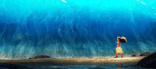
The colour palette works so well in this film, from the blue skies and seas to the green landscapes everything fits perfectly together, there are colours that people don't even notice such as the purple shadows which I've experienced through drawing, it's my favourite colour for shading. Overall each scene is blended in beautifully. and I would consider using some of the colours from this film and include it in future animations, here's an example of my favourite shot: